


How to Choose the Right Chart
Introduction
There are many kinds of charts. How to choose the right chart to effectively display data?
Charts can be divided into several categories, namely comparison, proportion, Trend or Correlation, Distribution, and Detail". You can choose the appropriate chart according to your own purposes.
Category | Explanation | Suitable Chart Types |
Comparison | Some charts can show the order in which things are arranged — are they familiar, or A is more or less than B. | Column Chart, Combo Chart, Bar Chart, Radar Chart |
Proportion | Some charts focus on each segment as a percentage of the total. | Pie Chart |
Trend | Trend is one of the most common Time-Series relationships displaying how the data change over time. | Line Chart, Area Chart |
Aggregation | Some charts can summarize the statistics of the indicators of the data. | Indicator Chart, Pivot Chart |
Distribution | Some charts can display how many items are included in each numerical range, typical information will include: “concentration”, “frequency”, “distribution”, etc. | Funnel Chart, Gantt Chart |
Detail | Some charts can show the details of the data and view the detailed data situation of a single piece of data | Detail Table, Spreadsheet, Calendar |
First of all, before selecting a chart, you need to figure out what you want to show through the data on your hand, that is, several major categories in the chart.
Comparison
Column Chart
A general Column Chart uses vertical columns to show numerical comparisons between categories. One axis shows the category being compared, while another axis represents the corresponding scale value.
The figure below shows the sales in each month.

Combo Chart
A Combo Chart has two Y axes which are on the left and right. Currently, the display types supported by a Combo Chart include Column Chart, Line Chart, Stacked Bar Chart, and Area Chart.

Bar Chart
A Bar Chart is just a Column chart going across.

Radar Chart
A Radar Chart is also known as a Spider Diagram. Each variable has an axis that emits outward from the center. The angles between all axes are equal, and at the same time, each axis has the same scale.

Proportion
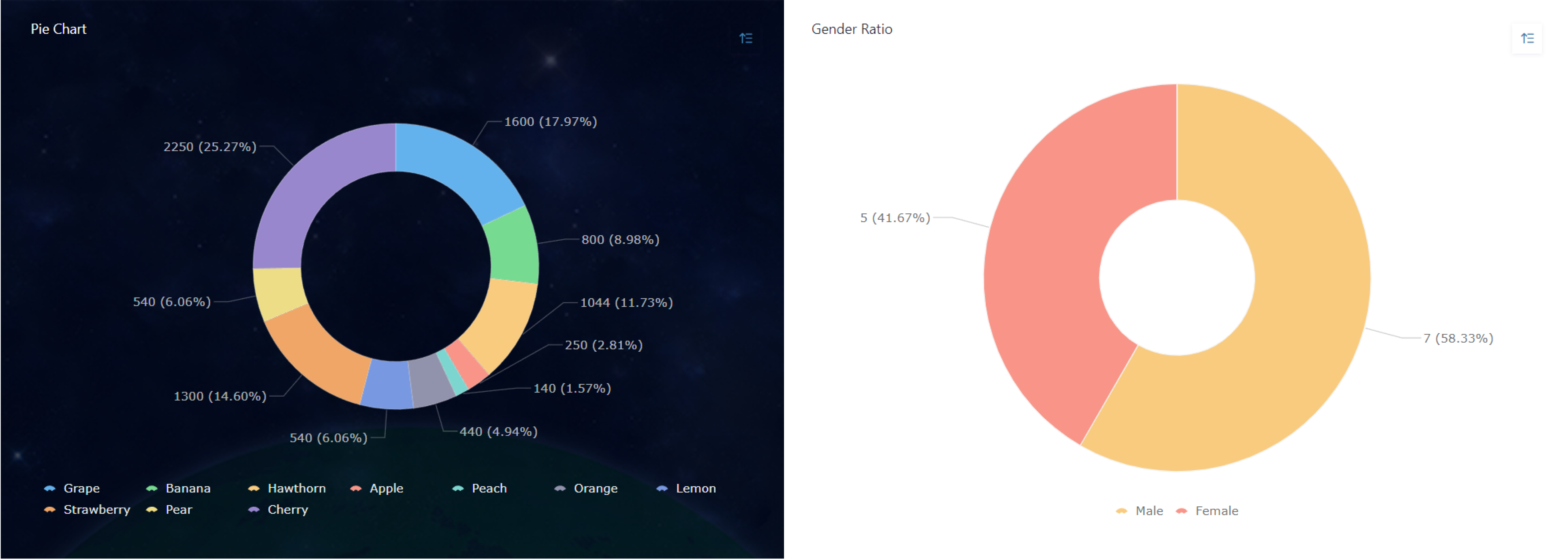
Pie Chart
A Pie Chart can clearly analyze the proportion of data, but it is not recommended to analyze data where the proportion differentiation is not obvious, nor is it recommended to analyze more than 10 dimensions.
Trend
Line Chart
A Line Chart is convenient for displaying how data are changing over time or in other ordered categories.
1. It can analyze the interaction and influence of multiple groups of data with time, so as to summarize and obtain some conclusions and experiences;
2. The size of multiple sets of data can be compared at the same time.
Jodoo line charts support Curves and Lines. As shown in the following image:

Area Chart
An Area Chart can emphasize the degree to which the quantity changes over time and can be used to draw attention to the trend of the total value.

Aggregation
Indicator Chart
The Indicator Chart can sum over a single measure, or sum over according to multiple dimensions.

Pivot Chart
A Pivot Chart is of interactive and can perform certain calculations, such as Sum and Count.
The chart below aggregates sales details of different fruits:

Distribution
Funnel Chart
A Funnel Chart is suitable for one–way analysis with one relatively standardized business workflow, long cycles, and many links. By comparing the business data of each link in the funnel, a Funnel Chart can intuitively display the node where the problem lies, and then you can make a decision.
Common business analysis scenarios include:
- Sales funnel analysis in sales
- SEO conversion analysis in marketing
- User path funnel analysis in e-commerce

Gantt
A Gantt Chart is very commonly used in project/task management. It graphically shows the sequence and duration of a specific project through a list of activities and a timescale.
For example, in project management, you can evaluate the progress of work:

Details
Detail Table
A Detail Table can display data details. Click on a single datum to view data details.

Spreedsheet
A Spreedsheet can display and manage the form data in a dashboard. In addition to being able to view detailed data for which you have permission in the form, you can create and export data that published to you.

Calendar
The functions of a calendar and a data management table are similar, and data can be operated and managed within the scope of permissions. It's just that a calendar presents data in the form of a schedule, while a data management table presents data in the form of a table.
The prerequisite for using a calendar to display data is that the form data must include a date and time field, so that the data can be viewed and managed over various dates according to time.

Notes
The following chart types are Stats. After selecting "Stats" to create a chart, you can choose the following charts for data analysis and display:
- Indicator Chart
- Pivot Table
- Column Chart
- Bar Chart
- Line Chart
- Area Chart
- Combo Chart
- Pie Chart
- Radar Chart
- Funnel Chart
When designing a dashboard, if you want to use the above charts for data display, you need to select Stats first, and then select a specific chart type.
