Stacked Column Chart
Introduction
Functions
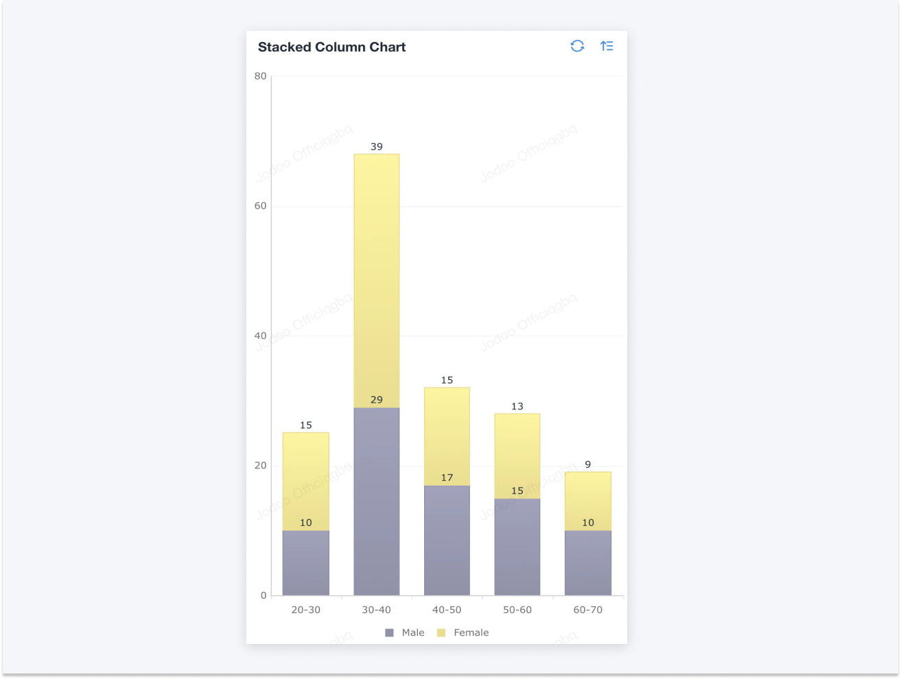
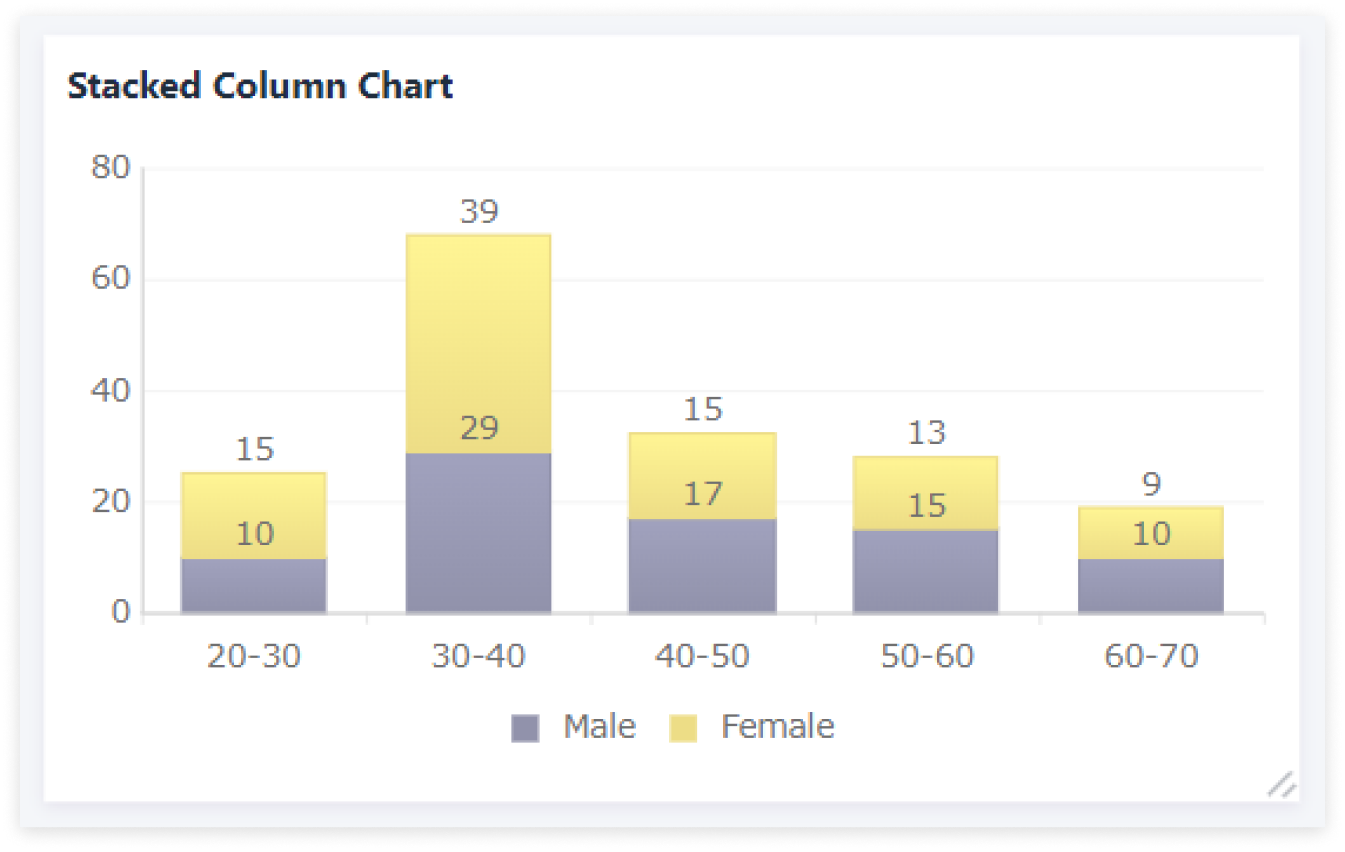
A stacked column image can be used to show the proportion of the sub-categories in the larger categories by splitting each column into sections. This type of chart can visualize the value for each Measure, and reflect the sum of Dimension as well.
Application Scenarios
The stacked column chart is mainly used to show the relationship between the parts and the whole. For example:
- Show the comparison of the traffic from different channels for a product within a week.
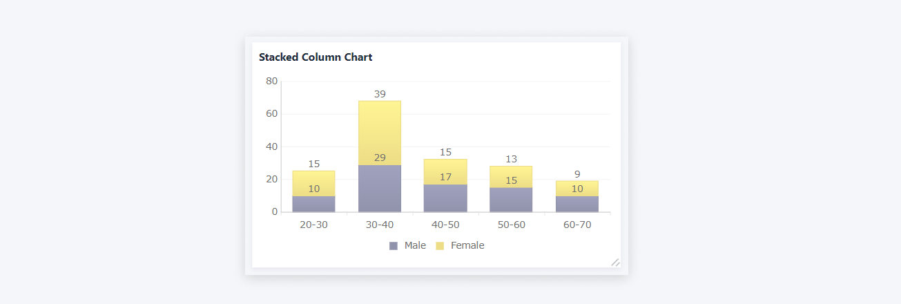
- Analyze the gender distribution among different age groups of the enterprise.
Basic Requirements
Dimension | Measure |
One | ≥ Two |
Preview
Setting Procedure
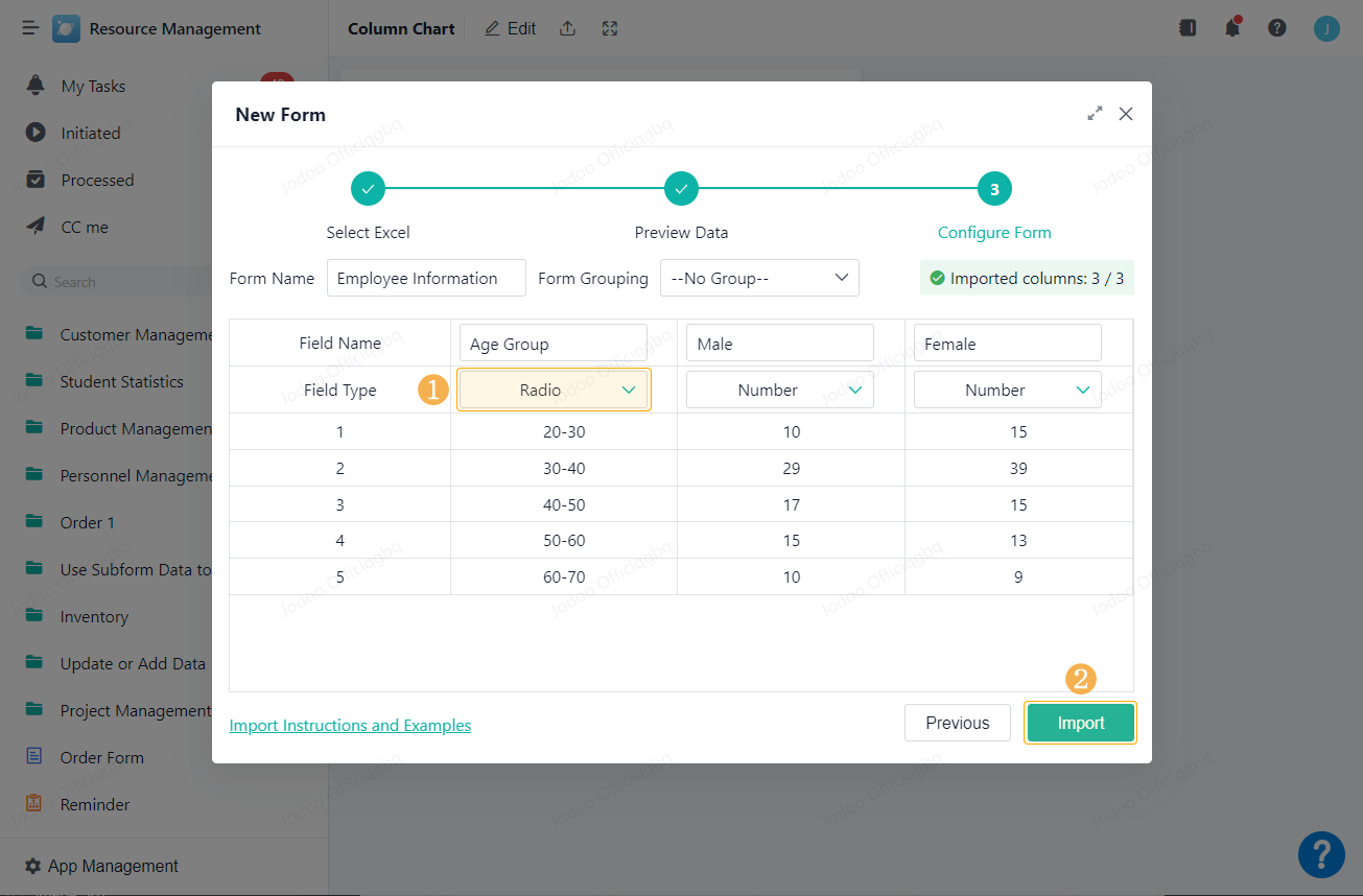
This article will use data imported from Excel to show how to set a stacked column chart.
Importing Data
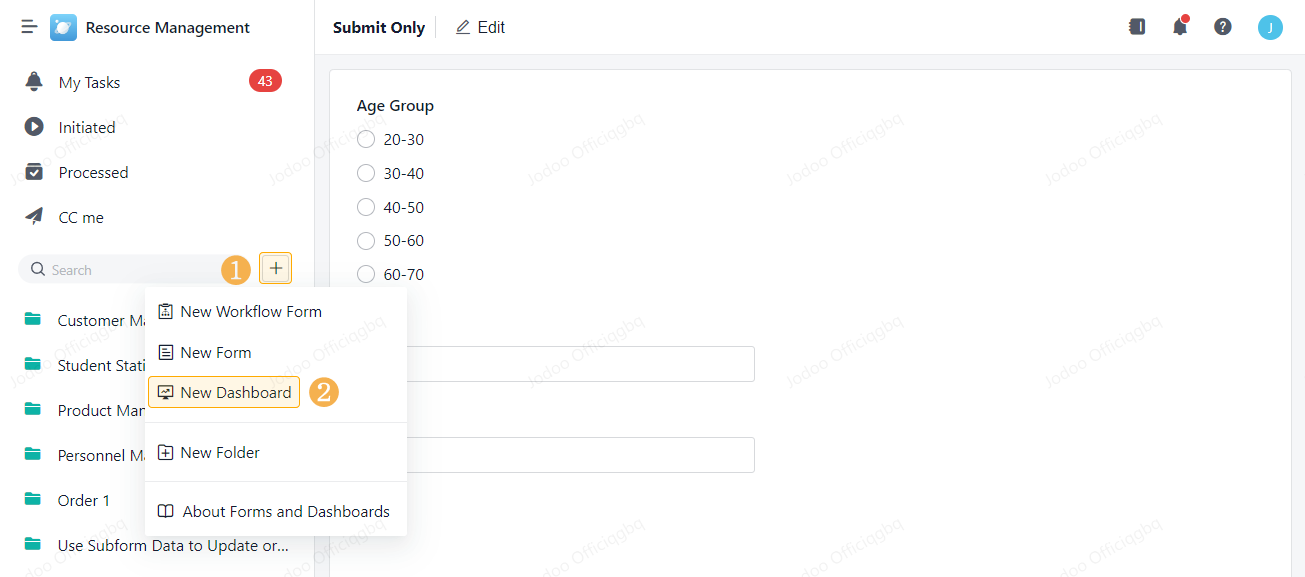
Visit the authorized app, click and select New Form > Create from Excel.
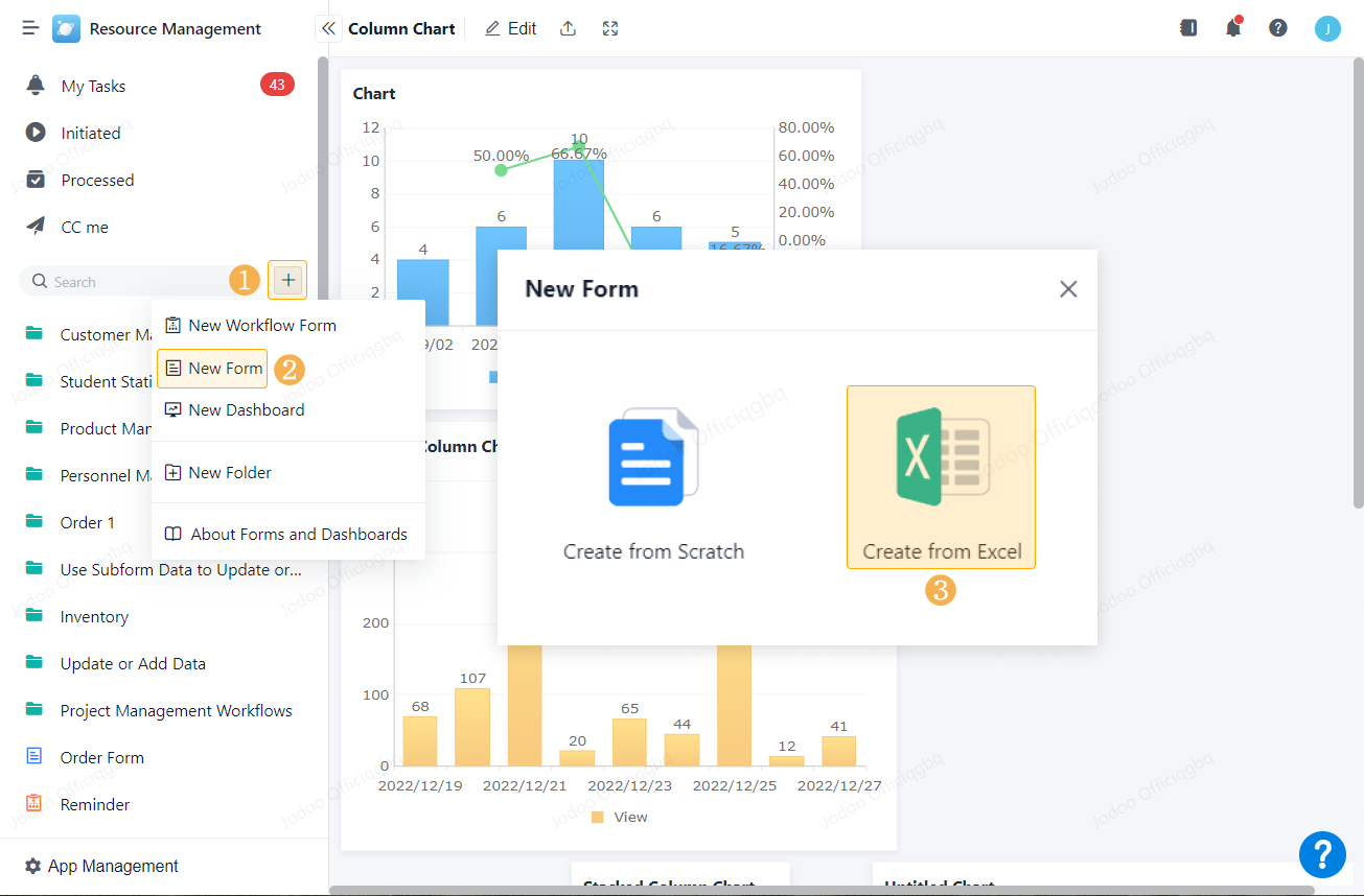
Then import the Excel data you have prepared. When importing, change the field to be used in Dimension from Single Line to Radio.
Creating a Dashboard
Go back to the app interface and create a dashboard.
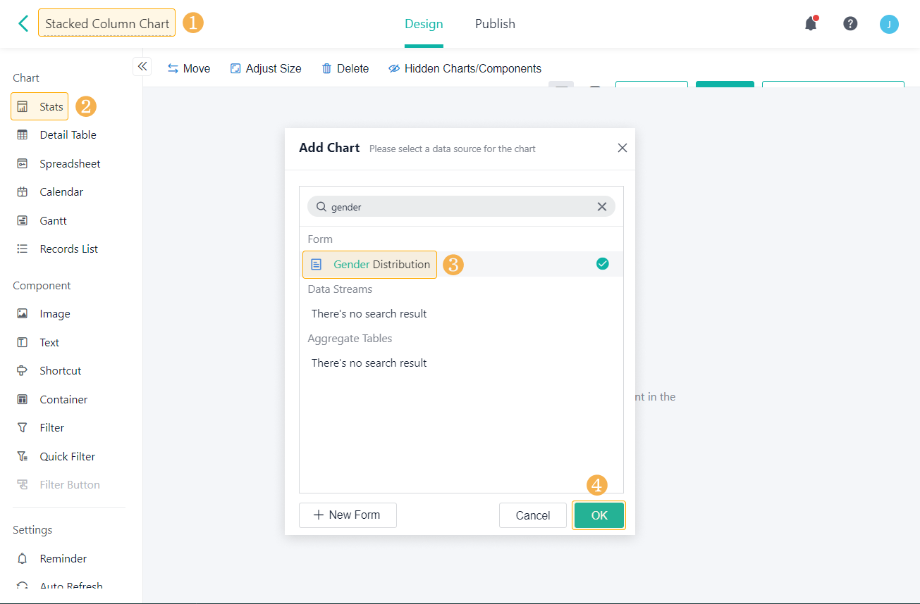
Then rename the dashboard, add a Stat, and choose the form you just created as the data source.
Setting the Chart
In the Stats page, rename Stat, drop and drag fields to Dimension and Measure, and set the chart type as Stacked Column Chart under Column Chart Type.
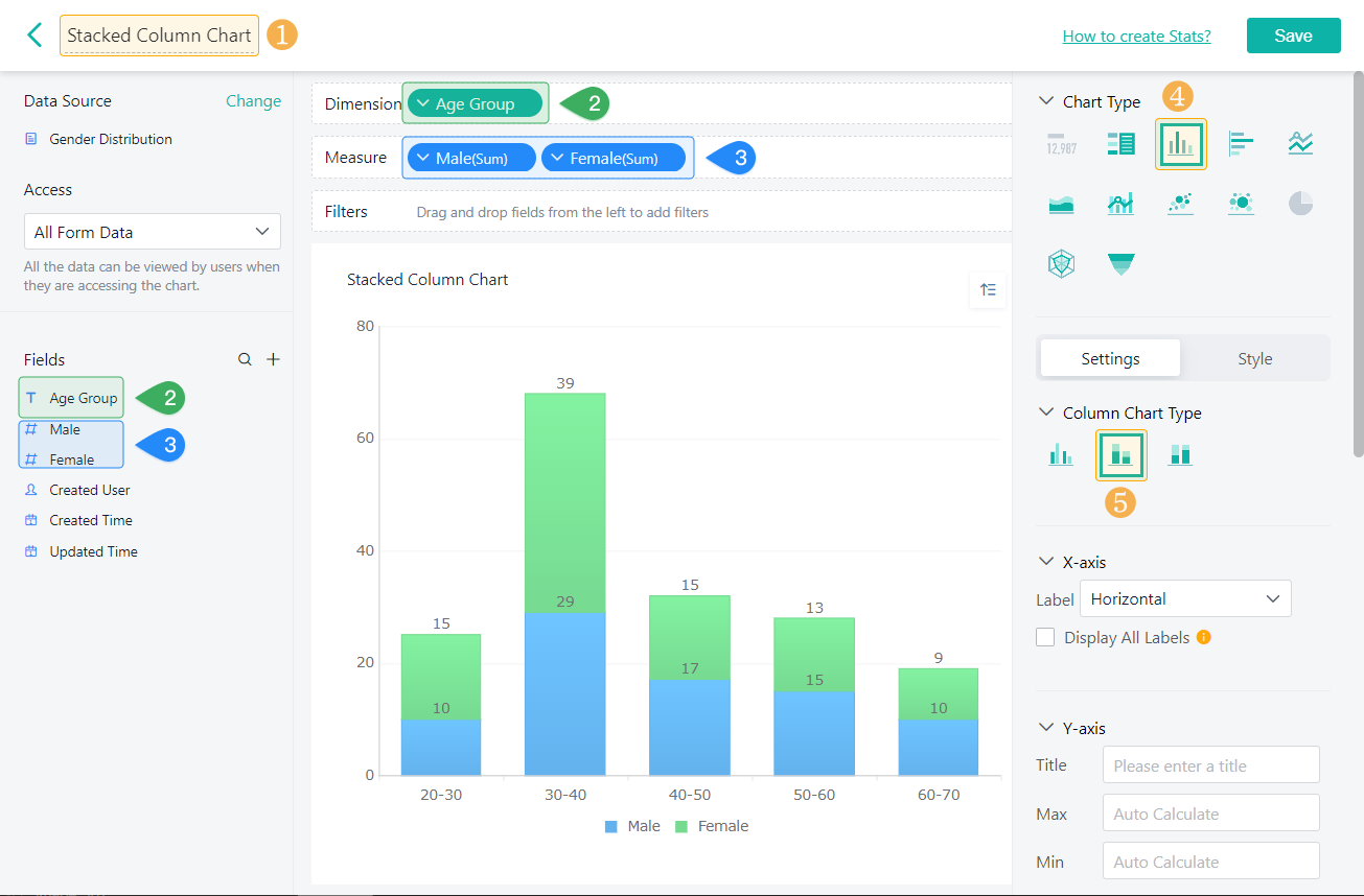
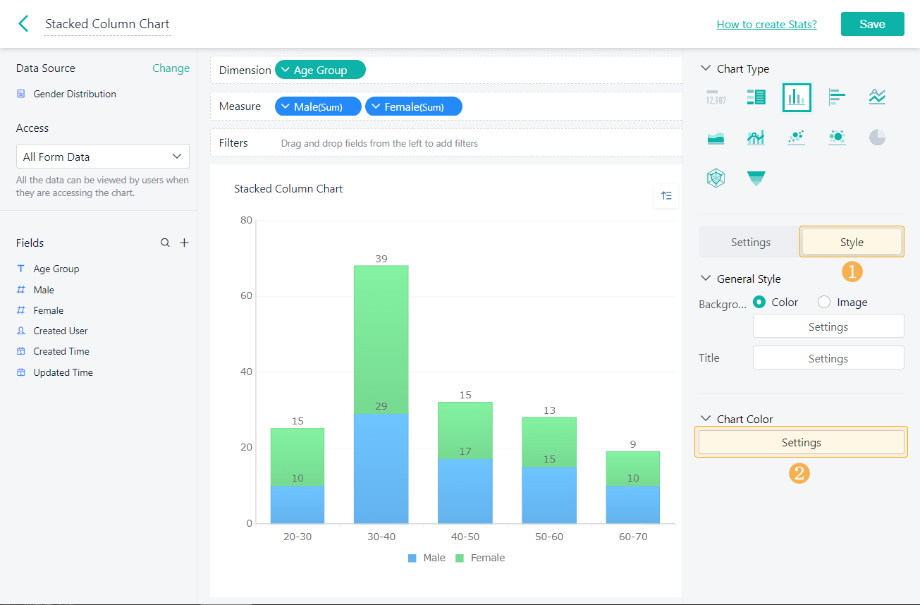
Chart Color
In Style, you can configure the color of the column chart.
Demonstration
1. On PC
2. On Mobile