


Settings
Introduction
Feature Overview
Under Settings, you can set Actions, Data Display, Legend, Column Freeze, X–axis and Y–axis, Data Alert, Chart Linkage, and other functions.
Different charts support different configuration features.
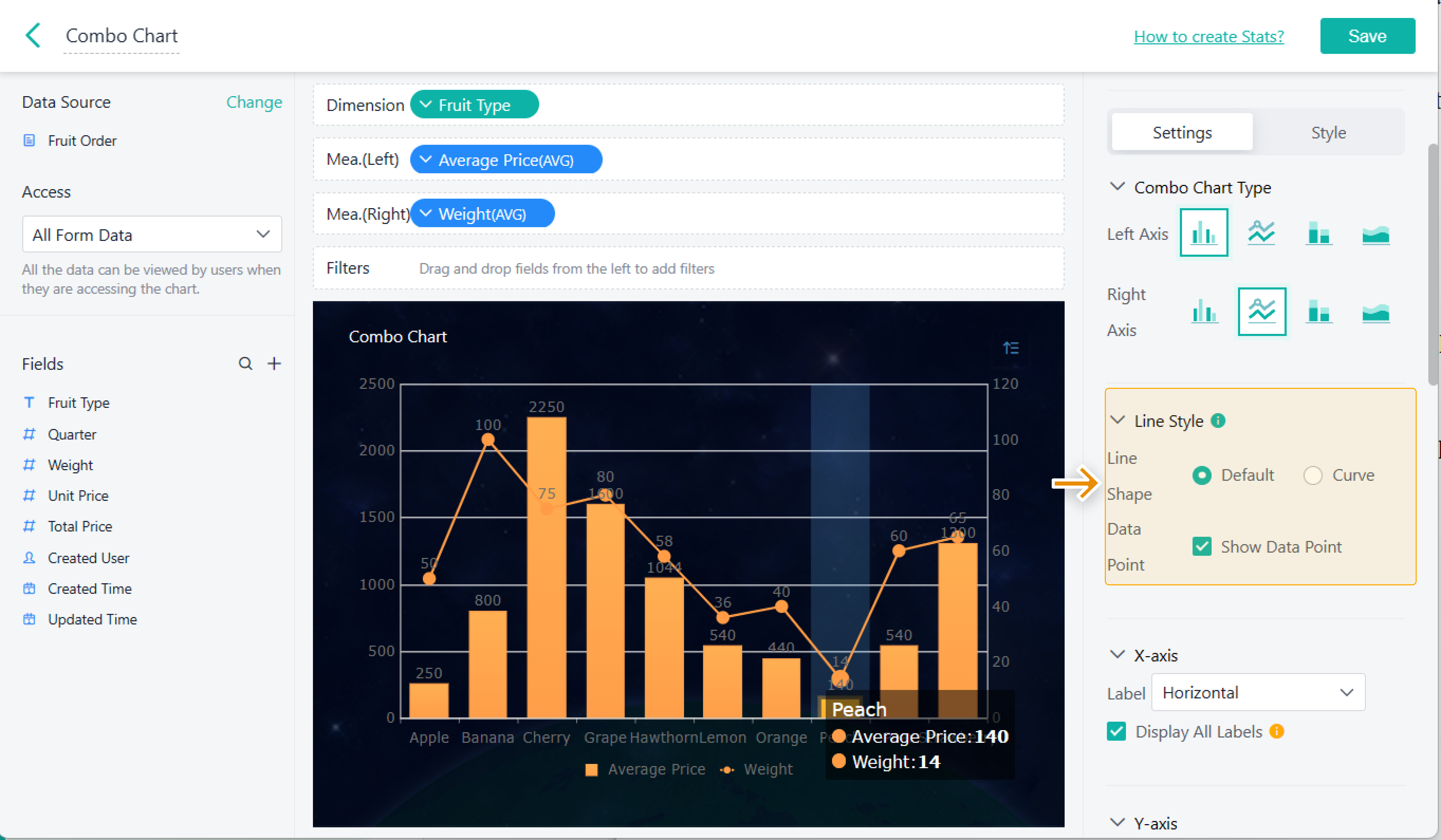
For example, these are the settings you can complete for a combo chart.

Scenario
In Jodoo, you can customize Chart Type, Label Field, Label, and other features in Settings when setting the chart component.
Actions
You can tick Export Data in Indicator, Pivot Table, and Detail Table. After that, a member can export data in the permitted components when visiting a dashboard.

Chart Type
There are several chart types you can select for Combo Chart, Radar Chart, Pie Chart, Bar Chart, and Column Chart and other charts
Combo Chart
You can select chart types for Left Axis and Right Axis in a combo chart respectively.
There are four types for each axis:
- Column Chart
- Line Chart
- Stacked Column Chart
- Area Chart

Pie Chart
There are three types you can select for a pie chart, namely, Solid, Doughnut (Thick), and Doughnut (Thin).


Radar Chart
There are two types you can select for a radar chart: Line and Fill.

Line Style
You can set Line Shape and Data Point for a line chart, an area chart or a combo chart.
- Line Shape: including Default and Curve.
- Data Point: ticking to show the data point in a chart

Axis
X-axis
An x–axis is a horizontal line in a chart. You can set the x–axis as follows:
Setting | Functions/Definition | Supported Component |
Label |
|
|
Display All Labels | If you tick Display All Labels, all the labels will be displayed. If not, the system will display part of the labels according to the chart size. | |
Show Zoom Slider | You can adjust the left/right end of the zoom slider or drag it to narrow the display range of the chart. |
|
Here is an example of setting the x–axis in a line chart:

Y-axis
A y–axis is a vertical line on a chart. You can set the y–axis as follows:
Setting | Functions/Definition |
Title | It refers to the title of a Y–axis. |
Max | You can set the value in Max to adjust the y–axis scale. |
Min | If you set the value in Min, the minimum value will appear on the bottom line. |
Chart components, including Scatter Chart, Bubble Chart, Radar Chart, Column Chart, Bar Chart, Line Chart, Area Chart, and Combo Chart support the y–axis settings.
For example, set the Y–axis in an area chart.

Data Display
You can set Data Display to determine the amount of data you need to display.
Chart components, including Column Chart, Pivot Chart, and Indicator (1 dimension, 1 measure) support the Data Display settings.

Column Freeze
Column Freeze refers to freezing the dimension of a chart. When you slide a chart to check records, the column (s) will not move. For details, see Dimension Freeze.

Label Field
Label Field refers to the value on the node of a chart.

Legend
Legend explains the content and indicators represented by various symbols and colors on a chart, making the chart more understandable. It can be located on one corner or one side of the chart. You can either untick Legend or set Legend in the following ways:
- Bottom
- Top
- Left
- Right

Conditional Formatting
Conditional Formatting refers to customizing the background and text in the grid component. For details, see Conditional Formatting.

Data Alert
If you set the value in Data Alert, a red line will appear. Therefore, the operator in a company can adjust the business plan when some data is abnormal. For details, see Data Alert.

Reference Line
If you set Reference Line, the real–time data can be compared with the goal value so that a company can adjust its business plan in time. For details, see Reference Line.

Chart Linkage
If you set Chart Linkage, click a component, and the linked data in other components will be displayed. For details, see Chart Linkage.
