


Creating a Dashboard
Introduction
Functions
Dashboard is data visualization tool in Jodoo. It consists of Chart, Component, and Settings.
Application Scenarios
There are various charts in dashboards. You can set different styles of charts to meet different needs of displaying data in different scenarios.
Charts provided in a dashboard include the following types:
- Detail table and pivot table, displaying details and summaries of form data.
- Column chart, line chart, bar chart, radar chart, etc., revealing insights like data trends and comparing data by category.
- Pie chart, showing percentages of different segments.
- Gantt chart, for keeping track of project progress.
- Spreadsheet and calendar, for configuring data editing permissions.
Preview

How to Create a Dashboard
The procedure for creating a dashboard is roughly as follows:

Creating a Dashboard
Select an app and click New > New Dashboard.

Choosing a Chart
Charts are images or tables which can be used to display data.

Types | Example Picture | Introduction |
Stats | It can be used to analyze and display data in plentiful styles. | |
Detail Table | It can be used to list and display data in the form of tables. | |
Spreadsheet | Spreadsheet is similar to detail tables. In addition, it can obtain relevant operations on form permission sets and it can only be authenticated according to data source forms. | |
Calendar | It can be used to display data in the form of calendars. It supports to view data lists every day. | |
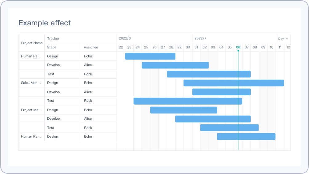
Gantt | Gantt is also called lined chart and bar chart. It can display the change of internal relationships of projects, progress, and other time-related systems as time changes. It can directly show when the plan will be carried out and show contrast between progress and request. . | |
Records List | It can be used to analyze workflows and processing progress in workflow forms. |


Selecting Data Sources
There are 3 kinds of data sources that can be analyzed in Jodoo:
- Form: data collected directly from forms(including forms and workflow forms).
- Data streams: data calculated and processed by data factory.
- Aggregate tables: data calculated by aggregate tables.

Analyzing Data
After adding the data source, you can select the type of charts going to analyze, and add dimensions and measures.

Charts Settings
You can further set the chart after finishing the settings of types, dimensions, and measures, including Settings and Style.
1. Settings
Different chart types have different settings. Here is an example of the settings of a combo chart.

2. Style
You can set General Style and Chart Color in Style.

Publishing a Dashboard
After finishing all settings of charts and components, you can publish the dashboard to members so that they can view and use.

If you need to publish it to external members, you can enable public link to publish public links:

Demonstration
For details about the effect, see 1.3 “Preview”.