


Pie Chart
Introduction
Feature Overview
A pie chart (or a circle chart) is a circular statistical graphic which is divided into slices to illustrate numerical proportion. In a pie chart, the arc length of each slice (and consequently its central angle and area) is proportional to the quantity it represents.
Application Scenario
The angle is proportional to the quantity it represents.

Basic Requirements
Basic requirements of a pie chart:
Dimension | Measure |
One | One |
Setting Procedure
Creating a Pie Chart
1. Select the dashboard you need to add an area chart to, or create a dashboard. Then click Stats and select the data source. The data source can be data from forms, the data factory, or aggregated tables.

2. Set the pie chart name, Access, and Chart Type in turn.

Adding a Dimension and a Measure
On the left field panel, select two fields, and add them to Dimension and Measure respectively.
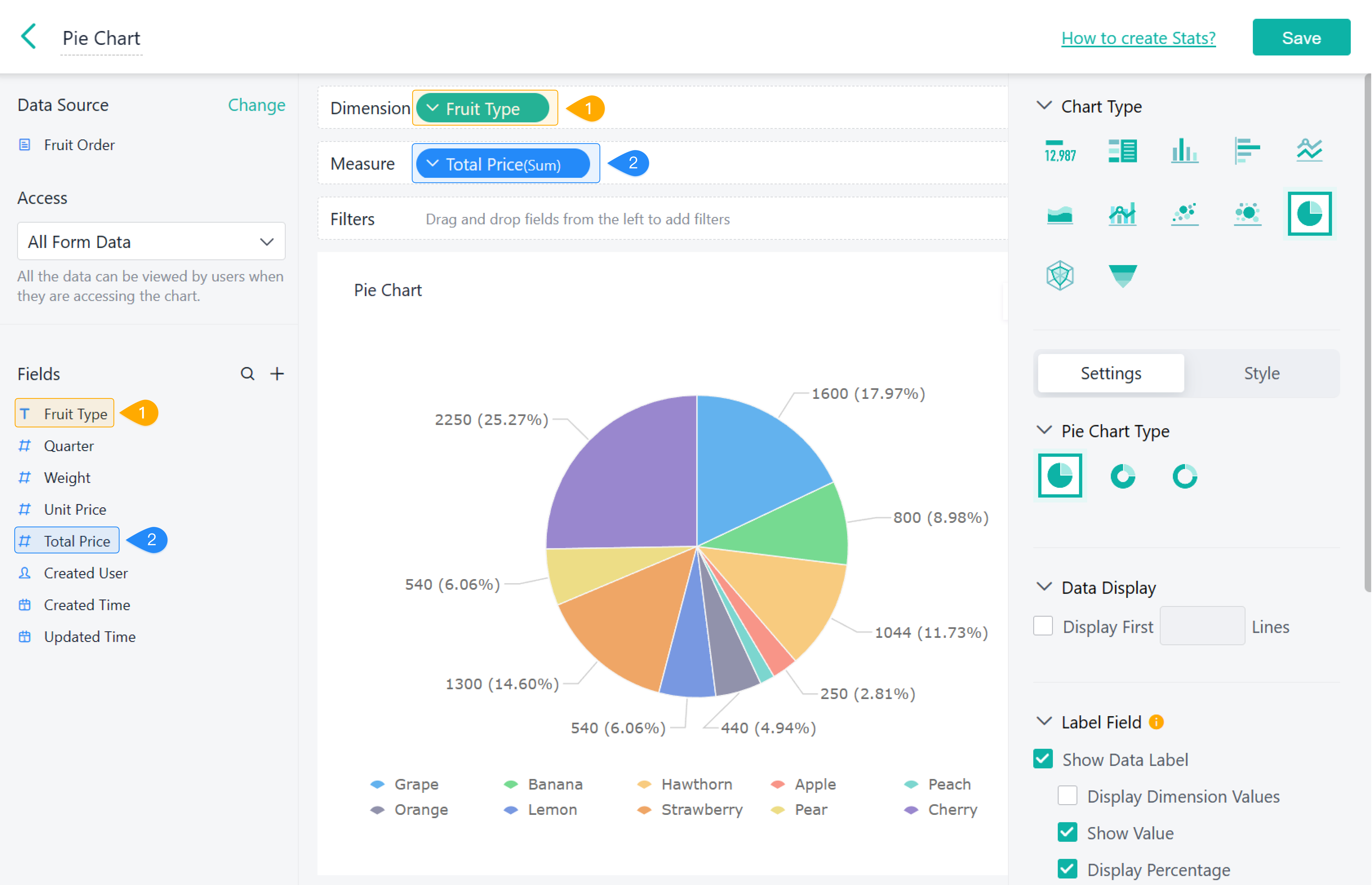
Configuring Settings
On the Settings tab, configure Pie Chart Type, Data Display, Label Field, Legend, Data Drilling, and Chart Linkage. For details, see Settings.

Component Styles
Set component styles in Style.

Demonstration
1. On PC

2. On Mobile

Except for the color of the chart, component styles do not take effect on mobile.