Updates on October 31
Current Version: 9.11.0
What's New
Jodoo brings new use case videos to supercharge your productivity
To help you make the most of Jodoo’s powerful features and boost your productivity, we're excited to bring you new use case videos packed with insights and tips! Learn How to Manage Permissions for Managers and Users in Jodoo and How to Import External Submission Data into Jodoo. These tutorials will guide you step-by-step to control access and streamline data imports, empowering you to make the most of Jodoo’s features. Don’t miss out—click the videos below to get started!
What's Enhanced
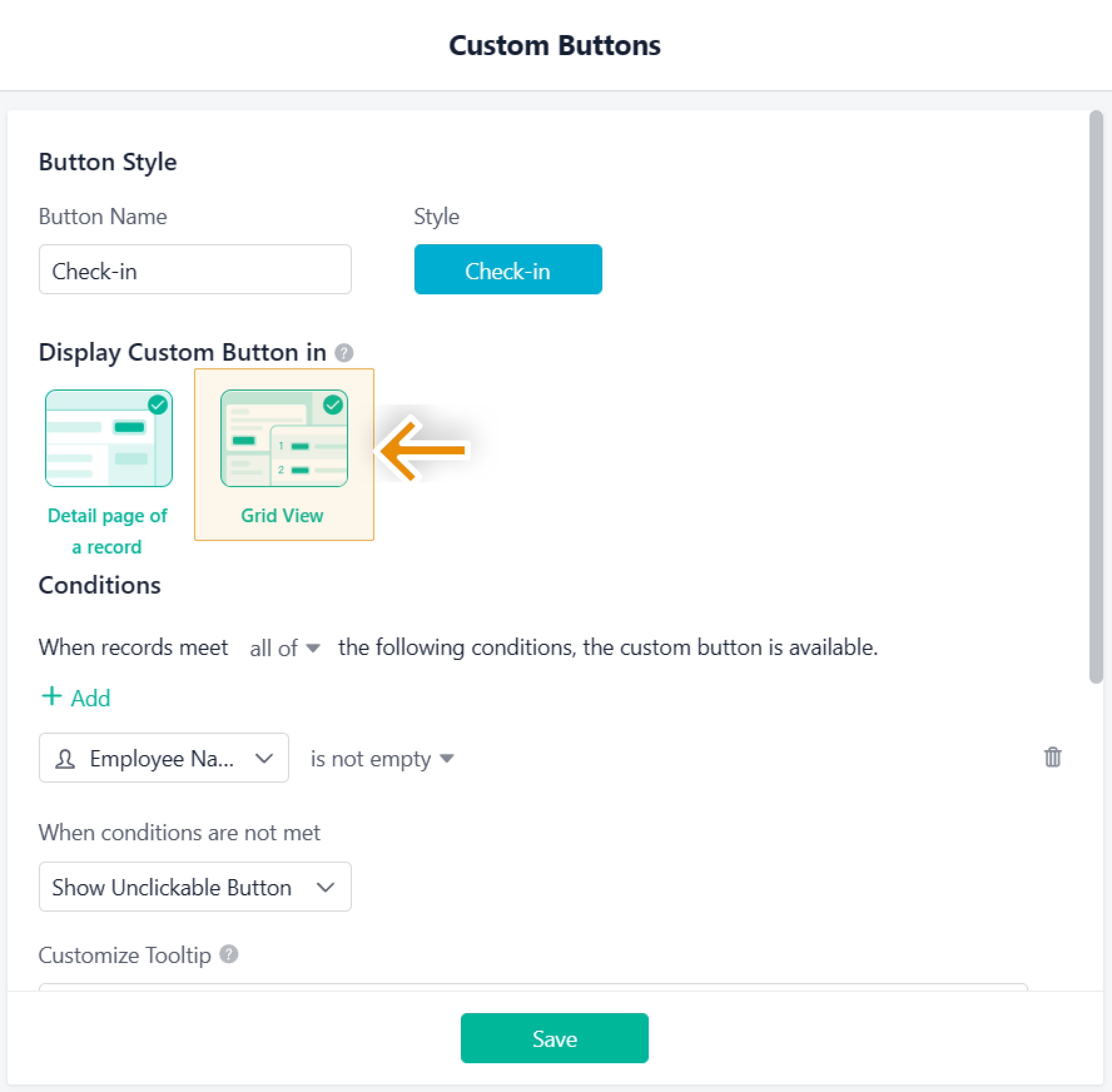
Now you can configure button display locations during setup
Starting from this version, you can choose the display position of custom buttons when configuring them, with two options available: the Detail Page and Grid View. Additionally, custom buttons are now supported in the Kanban View on PC and the Gallery View on mobile, further expanding their application scope and enhancing operational convenience across various business scenarios.
No more limits on the number of custom buttons displayed in a view
With this update, there is no longer a limit on the number of custom buttons displayed in a grid view. Admins can display multiple high-frequency buttons in the view based on business needs, allowing members to access and operate buttons more quickly, thereby improving business processing efficiency. Additionally, In the Grid view on PC, custom buttons are now fixed in the right column instead of the left column.
Customized submit button text will not be displayed on the record-editing page
After this update, the customized submit button text will no longer be displayed on the data editing page. Instead, the default submit button will be shown. For example, if you change the submit button text to 'Store,' it will appear as 'Store' on the data creation page, but on the data editing page, the default text 'Submit' will still be displayed.
The member selection list has been enhanced for a smoother experience
This update introduces the following adjustments to the department, member, and role selection lists, aimed at improving user experience and operational efficiency:
- Support for multi-keyword search to enhance search efficiency.
- A 'View all' button is provided, allowing users to see all selected options in the dropdown panel with a click.
- The width of the department organization structure area can be adjusted to maximize content visibility.
- In the member selection list under the 'Member' field, the original 'Dept.' category has been integrated into the 'Member' category to simplify the list structure.
Members' avatars will now be displayed when selecting from the dropdown list
After this update, when selecting members from the dropdown menu, their avatar will be displayed. Additionally, when searching, the member's department and ID number (for internal organization members only) will be shown to help distinguish members more easily and resolve issues caused by duplicate names.


