


April 11, Version 8.8.0
Current Version: 8.8.0
Business Process
Introducing the Automations Pro
To meet users' demands for automating repetitive task in more complex scenarios, Jodoo introduces the Automations Pro. This advanced feature allows you to design more complex business processes with greater flexibility and efficiency, achieving the next level of automation. Compared to Automations, Automations Pro features the following advantages:
- Visualize your business design: use an intuitive waterfall model to organize your tasks.
- Provide rich trigger events: Besides trigger events (such adding/deleting/updating records), Automations Pro also supports events specific to workflow forms, such as ending workflows. You can choose multiple trigger events for each automation, thus saving system resources.
- Powerful data processing capability: You can perform calculations and queries within your business process. Thus more records will be used in the process.
- Design your business flexibly: support adding a path. Based on the conditions you add, Automations Pro will take the path as desired.
For example, you set up rules to trigger automatic lead assignment amongst your sales reps as shown in the figure below. If leads are from Malaysia, they will be automatically assigned to the sales rep Martin.


Note:
1. Automations Pro and Automations are counted together in the total number.
Supporting Two Ways to Access Automations
After this update, you can create an automation in the following two ways:
- Create in a form: go to Extension > Automations > New Automation > Create old-version automation.
- Create on the App Management page: go to App Management > Automations > New Automation > Create old-version automation.


Form Management
Restricting Entries for Date&Time Field
In this update, Jodoo introduce a new feature named Date/Time Limit. This feature enables you to restrict the entries for a Date&Time field, thus preventing incorrect entries and reducing the unnecessary cost of corrections.
- Allowed Days of Week: choose specific weekdays.
- Allowed Earliest Date/Time: choose dynamic values, fixed values, or field values.
- Allowed Latest Date/Time: choose dynamic values, fixed values, or field values.
For example, in the Progress Tracking form, the earliest end date of a project can be limited to the project's start date, ensuring the filled time will not be earlier than the start of the project.


Note:
Dates and times within the set limits can be selected. Those beyond the limit will be automatically grayed out and cannot be selected.
Validating Custom Limit for Department(s)/Member(s) Fields During Data Importing
When importing data from an excel file into a form, if you have customized the limit for the Department(s)/Member(s) fields in the form, Jodoo will validate the data to be imported based on your settings. Only data that is within the predefined limit can be imported, ensuring the reliability and consistency of the data.
For example, you choose Malaysia under Available Options for the Sales Representative field. Then you can only import leads whose sales reps are located in Malaysia.

General Feature
Upgrading Custom Workspace
1. Optimize the layout of the workspace.
In this update, the Layout Components feature, which only supports three ways to organize items, is unpublished. You can now freely adjust the layout of components according to business needs. Here are the components that support width and height adjustment:
- Banners
- Rich Text
- My Charts
For example, adjusting the height and width of a banner:

2. Switch between card style and list style for the workflow center.
Following this update, for the workflow center, you can switch between card style and list style, catering to users' various needs and preferences.

3. Support all charts for the Charts component.
For the Charts component, you can now add all types of charts, further expanding the ways data can be presented. For example, display all charts.

4. Set Image Carousel and Interval for the Banners component.
For the Banners component, you can now enable/disable Image Carousel and set Interval. This allows you to set up how to cycle through a series of elements (such as images) according to actual needs, achieving the best information transmission effect.

Note:
After this update, when you access the workspace, components will be automatically laid out according to the new layout rules, and minor adjustments may occur.
Data Analysis
Enhancing Gantt Chart Viewing Experience
1. Optimize the viewing experience in certain scenarios.
In this update, we have enhanced the display of Gantt charts in specific scenarios:
- If you need to see everything in a column (dimension), adjust the column width.
- If you check a Gantt chart on mobile, drag the column separator or click the
/
icon to view the information you need.
- When you switch between tabs or cycle through tabs automatically, the system will display Gantt charts in a smoother way.
For example, adjust the column (dimension) width:

2. Introduce the Today button.
When viewing schedules for past or future dates, you can now quickly navigate and locate the current date by clicking the Today button located at the upper-right or upper-left corner. This feature enhances the user experience and efficiency.

3. Adjust the alignment of dimensions and data labels.
In Gantt charts, the alignment of text for dimensions and data labels has been changed to left alignment. By aligning text to the left, you create a straight edge on the left, helping users to view as much information as possible. This alignment helps enhance the cleanliness and aesthetic appeal of the dashboard.

4. Navigate Gantt charts on PC with new methods.
After this update, you cannot view Gantt charts through mouse dragging on PC. Instead, you can use the mouse wheel, scrollbar, and zoom buttons for navigation.
Changing Progress Bar Color Based on Percentage Value
For progress charts, in Progress Bar Color > Data Range, we have introduced a new feature that allows you to change progress bar color based on percentage values/progress. This helps users quickly identify the current phase of progress, and make timely and appropriate decisions.
Taking sales target management as an example, the progress bar's color distinguishes the achievement of targets. When the sales progress has not reached 80%, the progress bar turns red, signaling below-target performance. If progress has not reached 100%, it appears yellow, indicating near completion but not fully achieved. For progress that meets or exceeds 100%, the bar turns green, denoting target achievement or surpassing.


Pressing ESC to Exit Full-Screen Mode
When viewing a single chart within a dashboard in the full-screen mode, you can now exit the mode by pressing the ESC key, improving the viewing experience during the data-viewing process.
Optimizing the Field Settings Node
Following this update, the overall design of the Field Settings node has been optimized:
1. Optimize the method for setting displayed fields.
Before the update, you have to click Display Original Fields and choose fields from a dropdown when setting Field Settings. Now all fields are now displayed under Field Settings. You can check and choose them directly.

2. Support new method for sorting fields.
You can now sort fields with ease by dragging the icon.

3. Optimize the Calculated Fields.
For calculated fields, you can now click the icon (which was used to rename nodes before the update) to edit nodes. Moreover, the way to add/edit/delete calculated fields has be updated, making it easier for users to process and manage calculated fields.
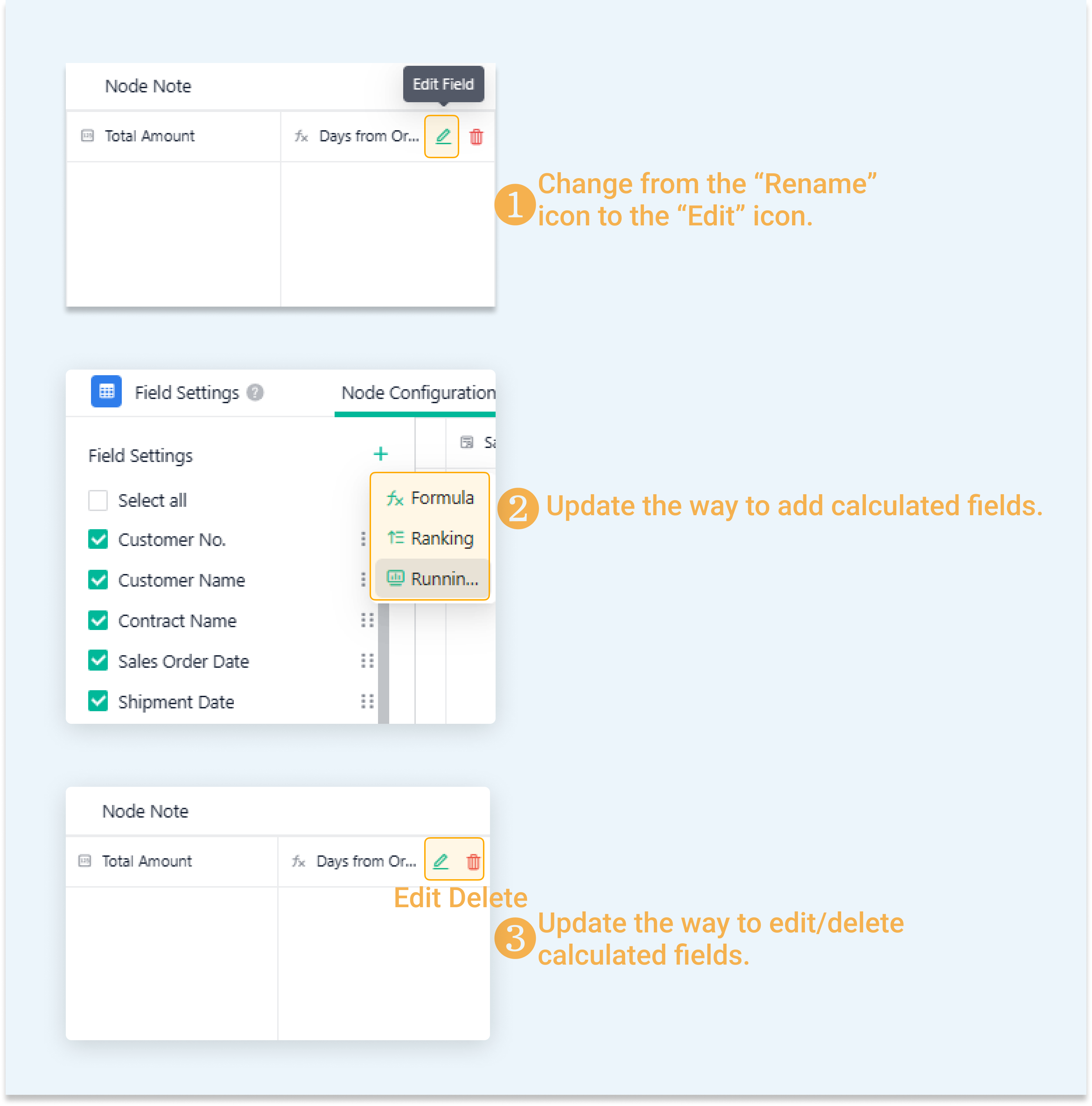
Note:
You can click the icon to access the editing page, and rename the calculated node.
Adjusting Column Width for Output Form
When previewing an output form, you can now drag the column separator to adjust the column width, displaying the full length of field names or field values. Moreover, caching the adjusted column widths ensures that these settings persist across sessions, saving users time and effort by not having to readjust every time they access the form. This kind of user-centric design is crucial in creating effective and efficient digital tools.

Viewing Data Sources for Measure in Aggregated Table
When adding/editing measures in an aggregated table, if the data used in the aggregated table comes from multiple forms, hover over a field and check its data source. This helps admins maintain and manage measures more efficiently.

Open Platform
Optimizing the File Upload Credentials and URL Get API
After this update, the format of the "transaction_id" will be validated before you call the File Upload Credentials and URL Get API. The "transaction_id" cannot contain "${var}", "$(var)", "$(var}", and "${var)". Otherwise, you may fail to call the API.
For example, the "transaction_id" contains "$(var}".

Do you have any suggestions for this update? Welcome to click feedback to tell us more.